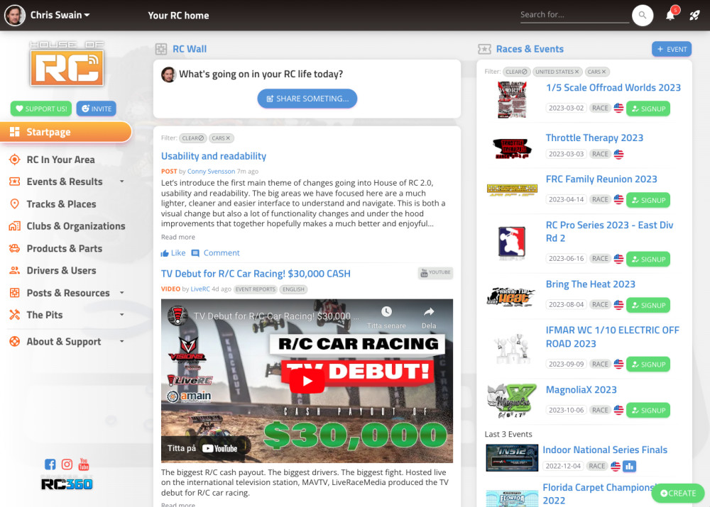

Usability and readability
We have introduced a top navbar that is always static and stays there so it’s easy to find common functions like your own profile and things, the breadcrumb navigation, the search field, a new notification menu as well as a new shortcut menu. The two last widgets are completely new and favourites has been something that many have requested. You can add any type of pages in House of RC into this menu, like a shortcut to your favourite, events, products or clubs.
The main left hand navigation sidebar is now part of the page in a more seamless way instead of being on a dark background, this makes the page look cleaner and not so heavy, there are also other reasons for this we will mention in a later post. Many features build on top of each other. We have also rearranged the navigation based on how people use House of RC.
We have changed our main title and menu font, from Russo One to Titillium. It’s the same kind of font but much easier to read and a little bit more compact saving valuable space. We have also updated the regular body font from Roboto to Open Sans, that is also more readable and goes very well together with Titillium. We have even increased the font size for the body text making it easier to read text, we know some people have used font scaling to make it easier to read before.
Another visual change is a new design of the panels, where we have moved the title and the top button out of the panel itself. This also makes it cleaner and focuses on the content better. In this change we also removed the orange box around the icon making it less cluttered.
Each panel has also went thru a design change to make them cleaner and also react better to different screen sizes. So the content flows better. We have removed the labels and made text flow more natural in sentences. We think it also makes it more personal and less data heavy. This job has taken a lot of time and will continue even after the 2.0 release.
There are so many small details we could mention here like the new way to display dates in a more apparent way or how we have tweaked the colors of the button and tags to be more lightweight, feel more relaxed and easy on the eyes or we increased the roundness of panels and buttons to feel more welcoming or the icons are not outlined to feel less heavy.
This is just some of the changes to improve usability and readability, you will hear more about this when it comes to the mobile experience and engagement as well. It all fits together. You will slowly get a feeling of the new House of RC, but we give you one piece at a time so we can discuss and explain each part